
Climate change is an issue that remarkably continues to be debated to this day. It is a fact that the Earth’s climate changes year to year and over millions of years. Global Warming is the advancement of climate change through human pollution of the atmosphere. Some of the greatest contributors to that pollution are cars and traffic, as well as power requirements to keep the lights on for cities across the globe. There are groups of people in government as well as society who do not believe that Global warming and climate change are a real threat to humanity, but most scientists, scholars believe that Climate change is real. It occurs naturally, but pollution and the pumping of carbon dioxide into the atmosphere is speeding up the process and destroying different environments and displacing or killing the wildlife that reside in these spaces. Humans have sped up or possibly even have altered the process of climate change, which is the main reason now that even car manufactures are starting to switch their lineup of cars to electric versions or even phasing out gas powered models as the entire line up is switched over to electric cars.
Visuals and representations of what an abstract process such as climate change are needed to help people understand not only the process, but how through pollution we have sped up the process through global warming. They need to understand what both processes are and how they are distinct from each other. There is a lot that goes into interpreting this data in a way that can be easily understood by the masses. There are different types of imagery that are used to either to help bring to light issues, help people understand them, sway opinions, etc. This post will be an analysis of different imagery used to create public awareness or persuade people to care about this cause. “We, as busy creatures, want information that is relevant, quick, and easy to digest. And since our brains can process visual information much quicker than textual, it makes sense that images and visual media have become our preferred format of information input”. (Pola Zen)
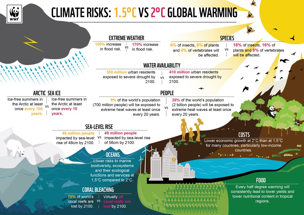
This graphic illustrates how data can be displayed in an inviting and eye-catching way by using and or creating graphics that directly relate to the data being displayed. While most data visualizations use imagery to interpret data sets, this image keeps data as text while associating imagery with the topic being addressed. “Researchers today face a particularly difficult challenge following the rapidly changing, complex landscapes of science and communication.
Science Visualization helps scientists overcome communications barriers through visual storytelling”. (http://sciencevisualization.com/)
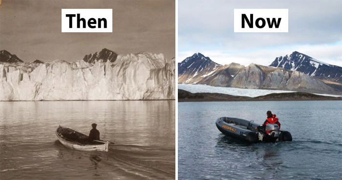
Create for shock value by showing people how much global warming continues to progress is another form of using visuals to not only drive a point home, but to possibly sway someone away from ignorance or misinformation and views or opinions based on non-factual viewpoints. This images effectively shows just how much has already changed because of global warming and allows viewers to not just hear or read about global warming, but to see its results for themselves through pictures and other visual media. “There are many different visuals that can enhance the effectiveness of a science communication effort. Photographs, carefully selected, cropped, and enhanced, if necessary, can illustrate key attributes or processes. Photos can often be annotated to aid comprehension. Conceptual diagrams can be considered ‘thought drawings’ that highlight key features and processes”. (Bill Dennison)
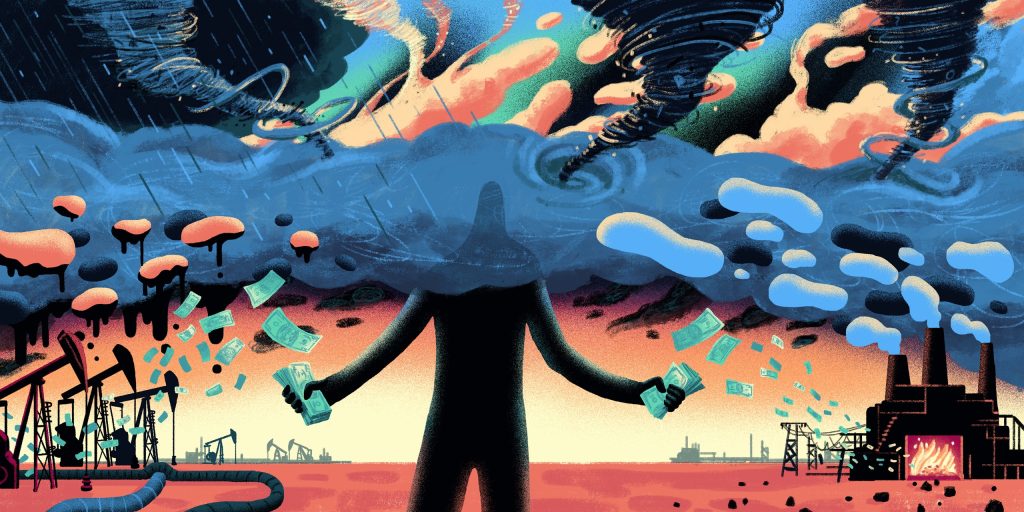
This image is telling a story. It’s an illustration that explains how humans, while fully aware of climate change and global warming, have been slow to change or create green technology that can replace the oil and gas industry because of the political and economic ties involved in that business. There are multibillion dollar corporations who’s main product is oil and gas and those corporations have lobbied politicians not only into keeping oil and gas as the main energy resource in developed countries, but have even sought their help in cleaning oil disasters they started such as the oil spills in the Gulf of Mexico that have devastated coastal towns and cities along the states that border the gulf. The image almost feels like humanity has a decision to make when it comes to global warming, and it’s one that will affect us all in the long run.
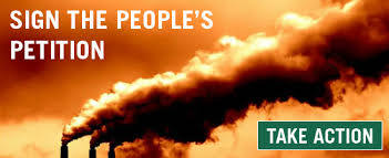
Used mostly in political imagery, this visual is a call to action. It shows factory smoke polluting the air around it but doesn’t offer much else to convince people as the audience this is made for doesn’t need to be convinced. This is made to get people to do something for this cause because it needs to be addressed. This could be for some grass roots campaign, or a call to get people to contact their local or federal government but its main purpose is to inspire some sort of action from its audience. “Hence, design communication is strategically aligned within the branding process. Armed with a creative breadth of skills, visual branding experts aim to stimulate cultural transformation, emotional bonds and the establishment of new norms, which places designers in the role of social change agents. In researching for commercial design, the contextual experiences of social and cultural attitudes are vital for understanding people’s lived experiences and attitudinal differences”. (S. T. F. Poon)
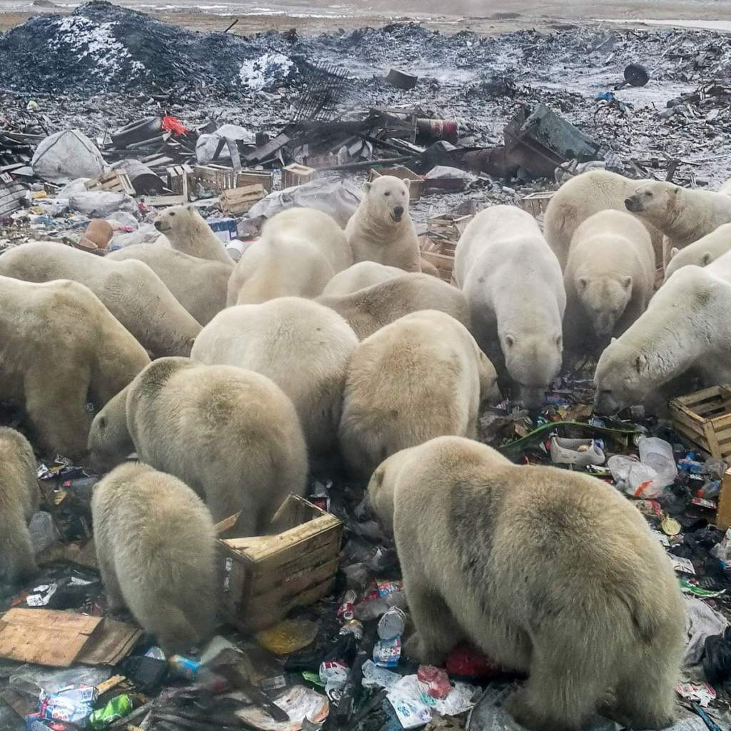
If you care about animals, then seeing this photo of polar bears going through trash to find food because the prey they would normally eat, and their environment have been spoiled due to global warming causing havoc on their natural habitat. This works much in the same way a call-to-action image would but motivates its viewers by pulling on their heart strings and creating emotional investment in the cause. “Images = Emotion and Connection. There is no doubting that we respond quickly, and emotionally to images”. (Donna Moritz)
These images demonstrate the way different visuals have different effects on viewers but all with the same goal of getting views to either understand or side with a cause. Not all causes are worth investing in be it emotional or economically, but a cause such as Global warming is one that will affect us all and changing the trajectory of our pollution habits will determine the future we will have as a species.
Resources
Zen, P. (2020, December 8). Storytelling secrets for creating images that connect. Yotpo. Retrieved October 11, 2021, from https://www.yotpo.com/resources/5-visual-storytelling-secrets-to-improve-your-marketing-images/.
Science visualization. (n.d.). Retrieved October 11, 2021, from http://sciencevisualization.com/.
Dennison, B. (n.d.). Practical visual literacy for science communication: Blog. Integration and Application Network. Retrieved October 11, 2021, from https://ian.umces.edu/blog/practical-visual-literacy-for-science-communication/.
Poon, S. T. F. (n.d.). Visual Communication and Design’s role drives Branding Innovation and social responsibility. Journal of Visual Art and Design. Retrieved October 11, 2021, from http://journals.itb.ac.id/index.php/jvad/article/view/2040.
Moritz, D. (2017, November 28). The shift to visual social media – 6 tips for business [infographic]. Socially Sorted. Retrieved October 11, 2021, from https://www.sociallysorted.com.au/shift-to-visual-social-media-6-tips-for-business-infographic/.
