
This week we are learning more about data visualization and taking raw data and translating it to something graphical/visual that people can break down easily and understand the data being presented. There are several different methods and common data visualizations out there such as bar graphs and pie charts, and something I have learned as a designer especially working in the real world with data visualization is that it’s one thing to understand the data being presented but it’s a totally different thing to take raw data and interpret it visually. To me this is one of the hardest parts about working as a UX/UI designer and I feel the more you can understand data visualization the more you can refine your skills as a professional product designer. “Information can be visualized in a number of ways, each of which can provide a specific insight. When you start to work with your data, it’s important to identify and understand the story you are trying to tell and the relationship you are looking to show. Knowing this information will help you select the proper visualization to best deliver your message”. (Hubspot.net)
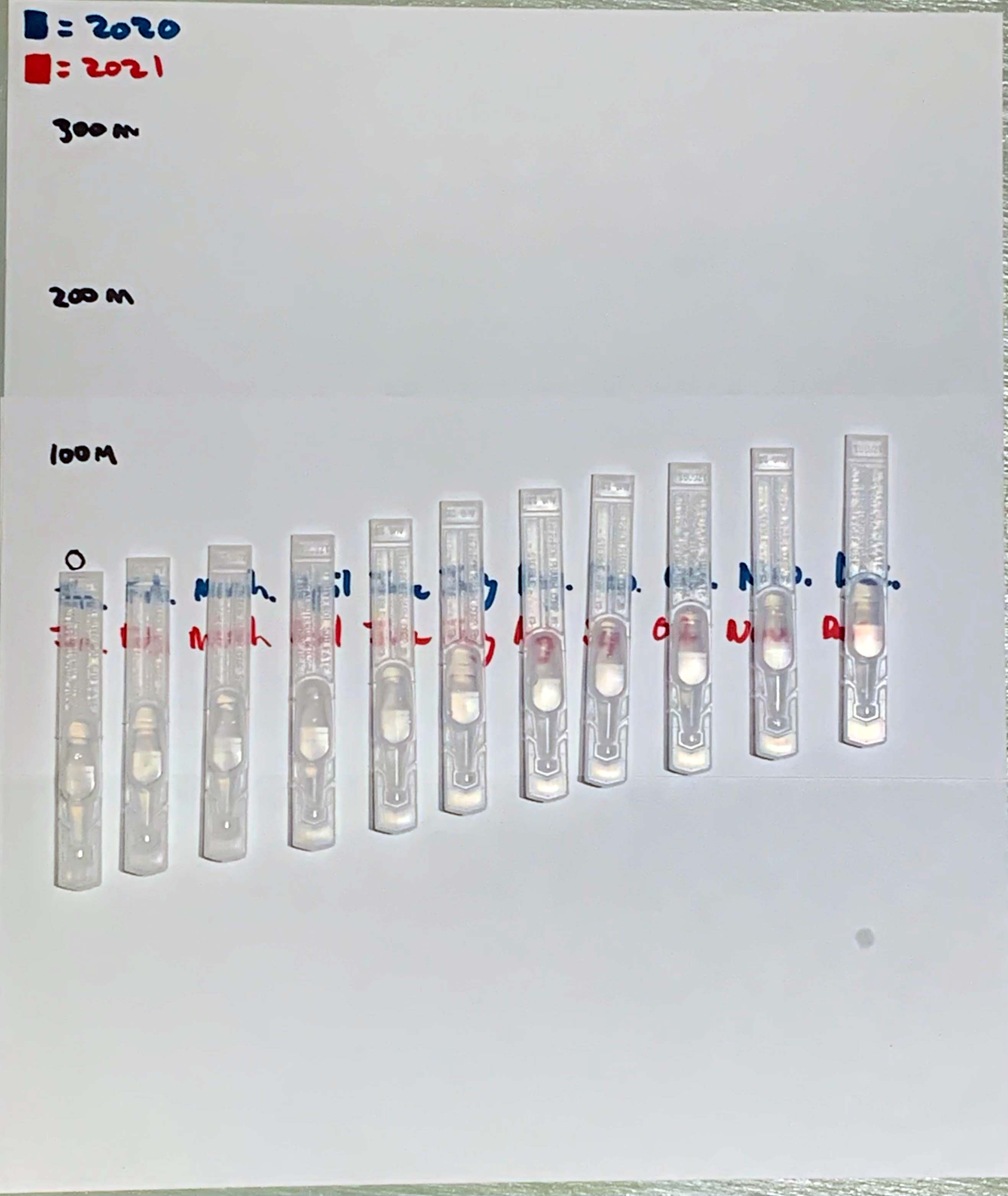
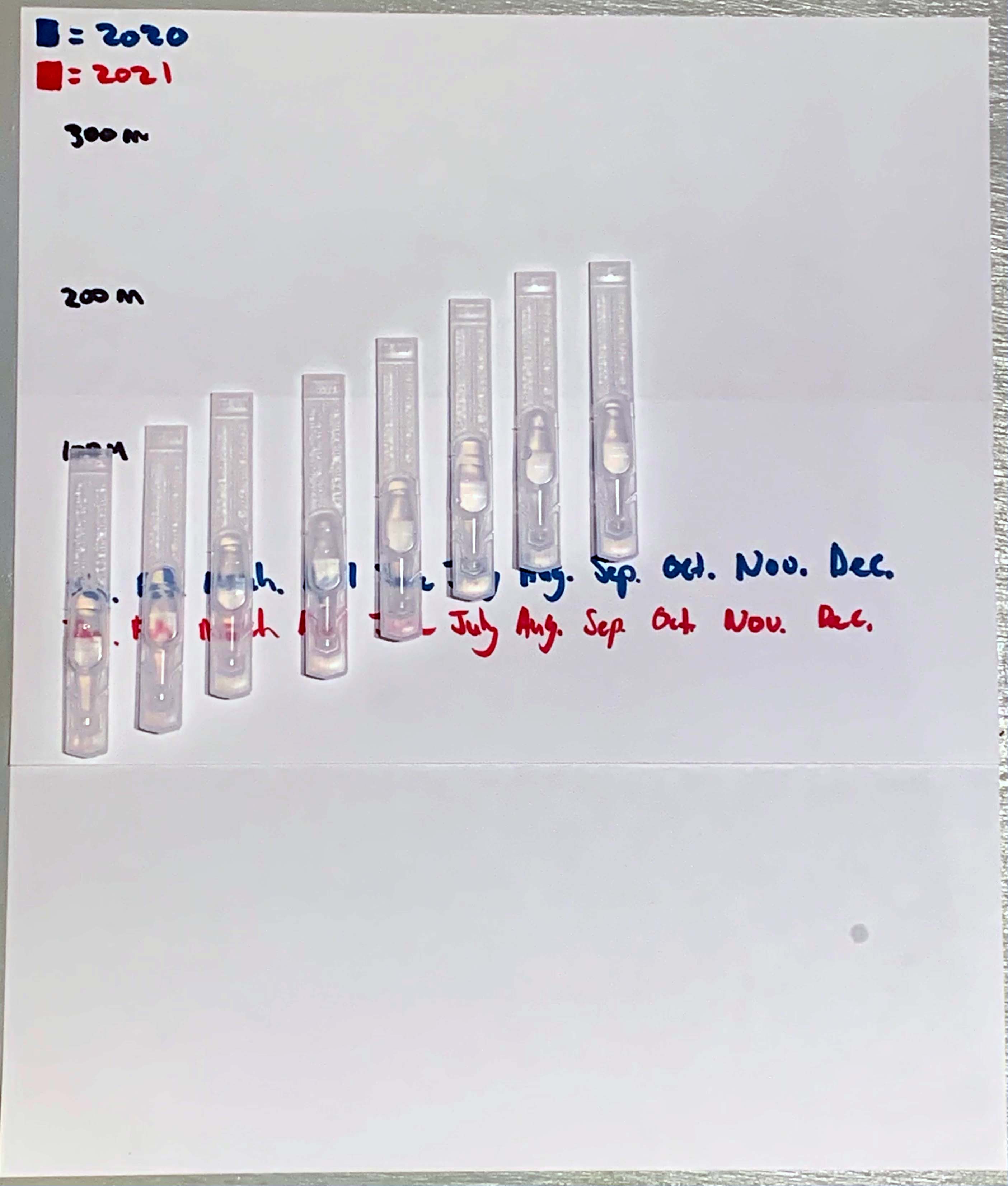
I decided to base my project this week around the Covid 19 total world wide infection rate from start of the pandemic to finish. I am using Albuterol Sulfate containers as that is one of the many drugs that are given especially to asthmatic people such as myself. Having gone through having Covid 19, I am thankful to have gotten through it recently. I wanted to create this visual to show how quickly this virus has gone through the world infecting its different population centers. We can only hope that the decline of cases happens soon, but as more new cases appear, we can only continue to do our best to slow it down and get people vaccinated.
Collecting data is something I had never done before this class other than data sources for reports, essays and other cited work. I learned a lot about personal data collection such as tracking my data by consistently logging information when required to do so. I found the work challenging not only in the aspect of data interpretation but creating the encoded data visualizations. It required as much creativity as it required analytical thinking.
One of the most instantly recognizable visualizations of data are charts. They take on many different forms, but the best chart make data accessible and easy to understand for a general audience. Much like UX itself focuses on user experience, charts should be designed to help those reading them easily comprehend the data that is being displayed. “take into account who and what your graphs and charts are for, and design accordingly. You might design a graphic to be super-detailed for a poster that people can stare at for hours. But if it’s for a presentation, you should keep the words to a minimum”. (Yau)
Personally speaking, charts that have strong data organization, and are made to lay out the data as simply as possible for easy access are visuals I respond well to. Certain data sets can become very complex and it takes thought in order to create visuals that break that data down in simple terms that people can understand without spending a lot of time trying to figure out what is being shown. Any chart or data visualization that achieves this has done its job in my opinion.
Resource
Hubspot, and Visage. “DATA VISUALIZATION 101: HOW TO DESIGN CHARTS AND GRAPHS.” Https://cdn2.Hubspot.net/Hub/53/File-863940581-Pdf/Data_Visualization_101_How_to_Design_Charts_and_Graphs.Pdf.
Yau, Nathan. “7 Basic Rules for Making Charts and Graphs.” FlowingData, flowingdata.com/2010/07/22/7-basic-rules-for-making-charts-and-graphs/.
