
Full Portfolio page: https://introspectivedesigner.com/
Creating my online portfolio was a challenge. Not just technically when creating a cohesive design for every project I worked on this semester, but because of the extension I needed while battling with Covid-19. It put me out of order for a few weeks, over a month, but I wanted to come back strong to finish this course out with everything I have learned and created in one cohesive portfolio that can be viewed from my WordPress site. I have a portfolio website http://www.designbyangelvazquez.com, and this will just be the latest addition to it! My design for the portfolio is modern and simplistic. I chose to add my branding for each piece to show cohesion across all projects no matter how different they may be.
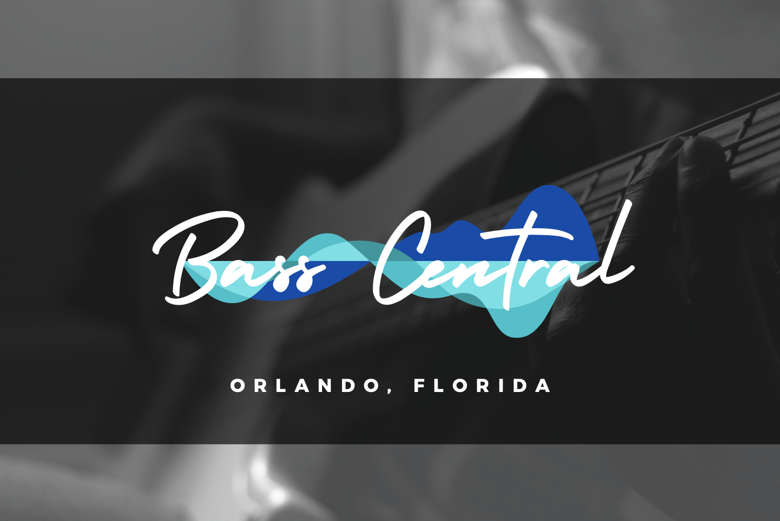

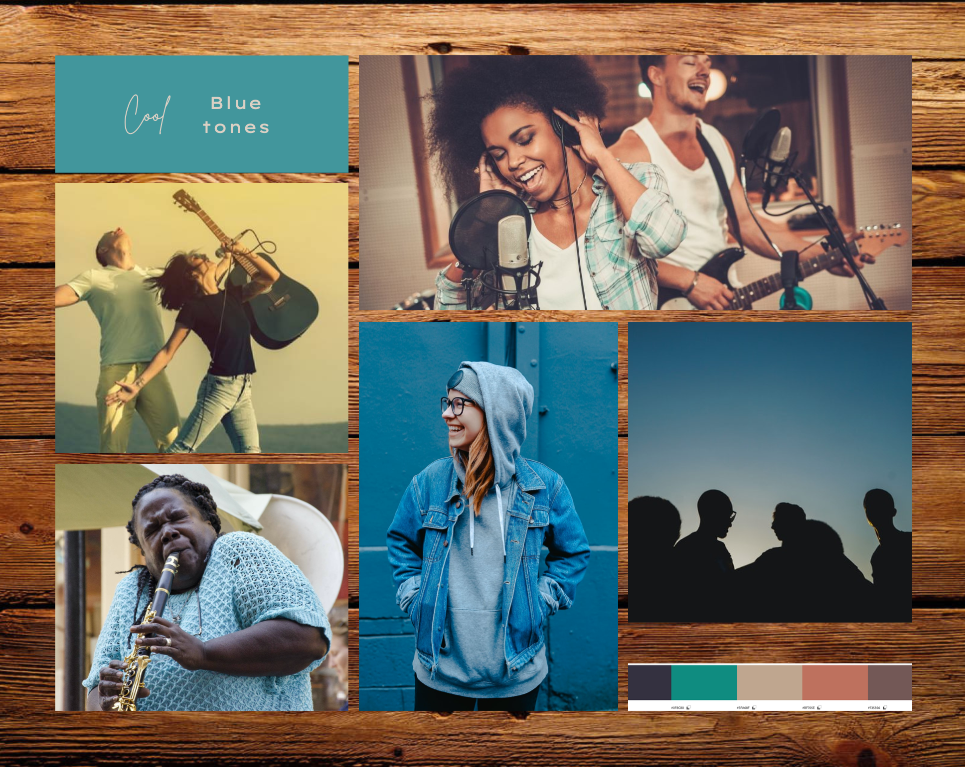
In the first week of our course (ICM 502 Visual Design) we explored branding and the different steps it takes to create a brand plan. Part of this week’s lesson was to choose a local store to analyze, create a competitive analysis, and a rebranding package by putting together a brand plan. The deliverables this week were 4-6 logos for the company, a mood board, and the brand plan. I chose a music store here in Orlando called “Bass Central. Bass Central is a mom-and-pop store that specializes in selling bass guitars and offer other instruments, music equipment, and gear.
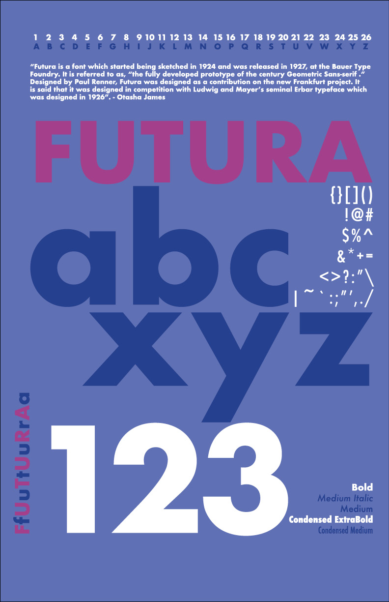


Continuing my work, I created a Type specimen poster. These posters show off typefaces by displaying different characters and styles using a specific typeface. For this project, I chose Futura as the classic font I used for this project. In this project I chose to use two colors, as well as white to create the poster. I wanted to highlight both lower case and capital letters, numbers, symbols and everything that showed the range of the font that I chose. Considering this is the first type specimen poster I have created (I have been in design for a decade almost) I was excited to create something with my own unique style to it.

In week 3, we started work on understanding color theory. I created 3 posters that showed different ways to use color, breaking down 3 company’s color palettes and branding conventions, as well as researching the meaning of color to different cultures. I started work by researching how meaning was attached to color in 3 different cultures around the world, and ended up using three different color schemes to create the final posters.
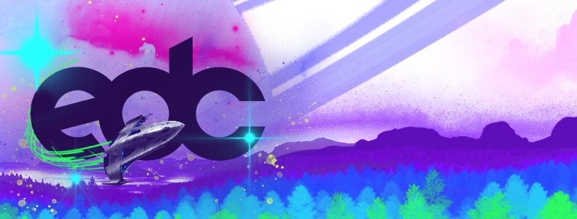
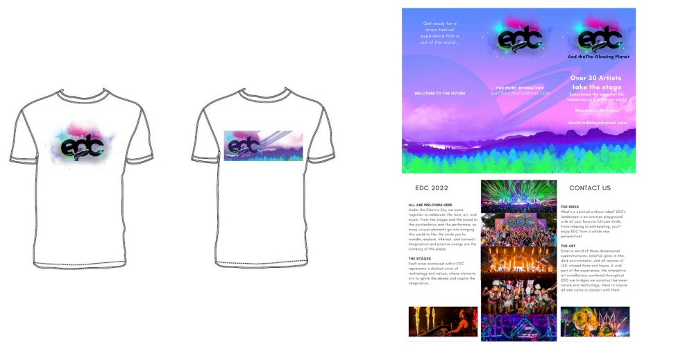

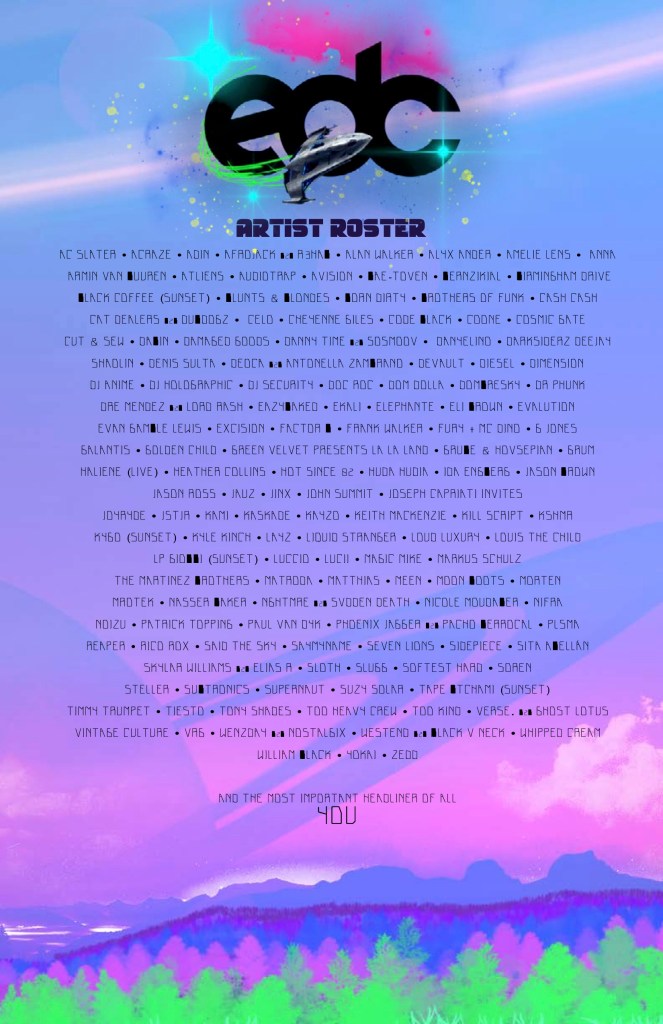
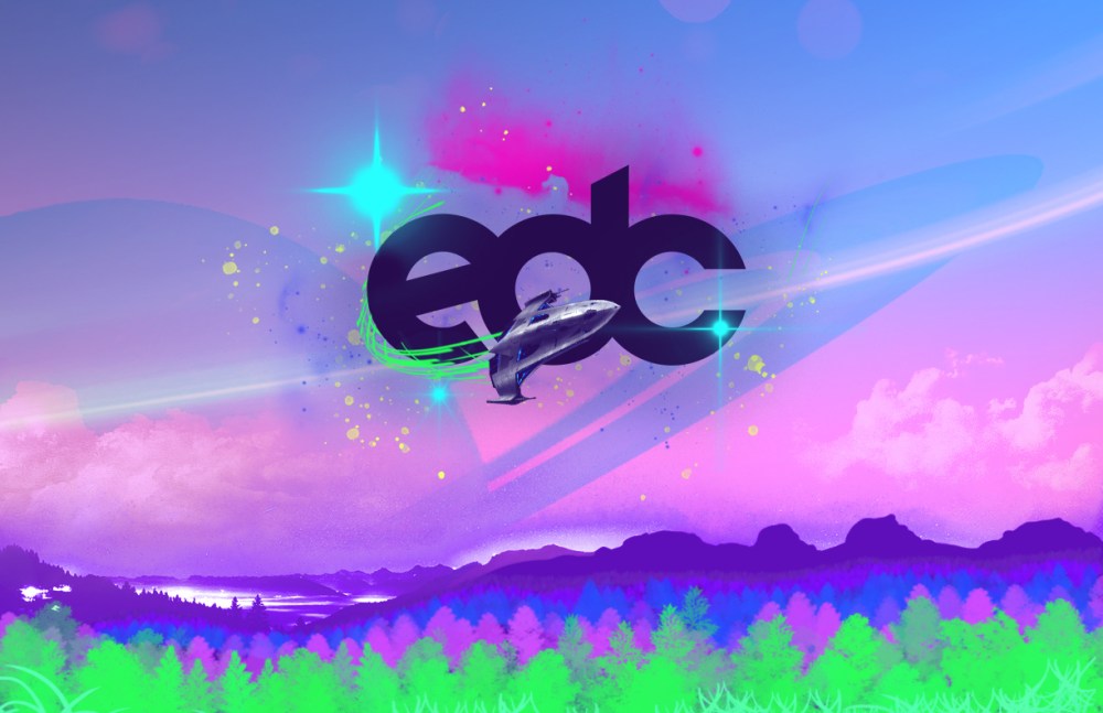
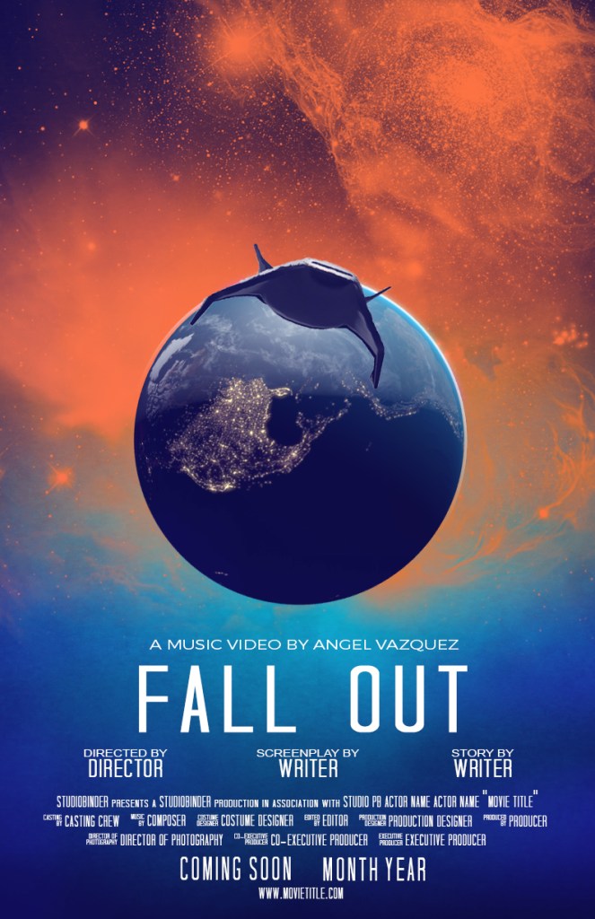
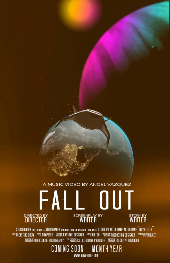
For this project I chose EDC Orlando, as that is where I live and wanted to create my own take on this visually appealing and exciting music festival. I chose to create the event campaign creation for the 2022 festival season because I wanted to place it in the future but not too far off. I want to give it more of a sci-fi feel this time around while keeping the awesome glowing flora, and the colorful and inviting ambiance that EDC is known for creating for their promo materials and visuals.
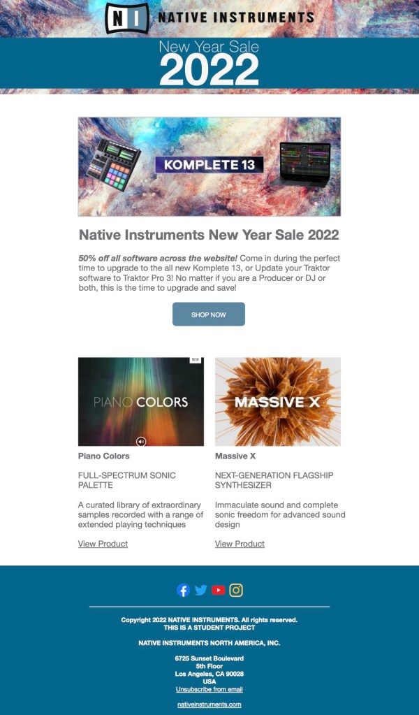
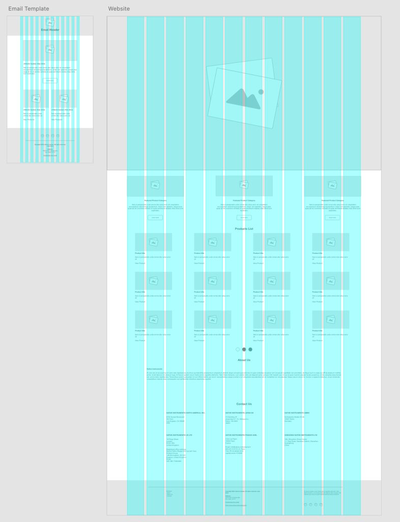

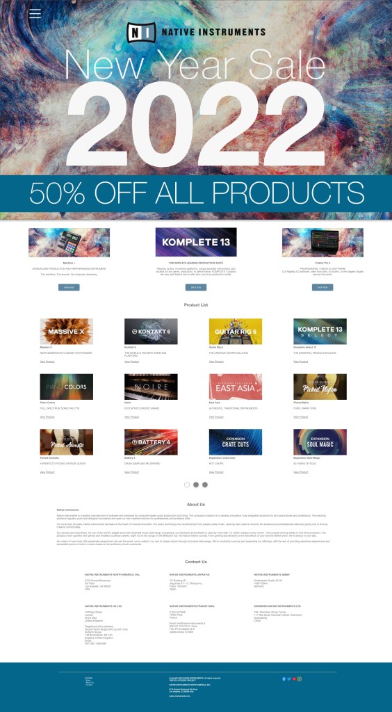
For this promotional email and special sale one-page website, I decided to create a campaign for a “New Year 2022” sale, which features 50% off on all digital products across their store. Native Instruments is known for their flash sales especially during the end/beginning of the year and during the holidays.
I enjoyed this course and creating these projects. I hadn’t taken a graphic design course since my bachelors so this was a great course that helped me to refresh my knowledge of this subject. I challenged myself creating these projects and am really proud of how they came out, especially the email/website prototypes, and the EDC festival package. I will be taking these to the next level and refining them for my capstone portfolio.
