
One of my favorite websites is also one that has been popular since the earlier days of the internet: YouTube. It has been a game changing video hosting platform that has changed how we consume entertainment, share our memories and moments, and explore a whole range of media from music, movies, tv, platforms, content creators, and so much more. Personally, I think YouTube is a site that has a lot going for it still in the future. While most people are in love with music streaming platforms such as Spotify or Apple music for example, I think the way YouTube incorporates either music videos or music with visualizers and animations is going to become the norm sooner than later. YouTube already has a leg up on other services when it comes to that is one of the many reasons why I think it’s more relevant now than ever.

When it comes to the design of YouTube, it has a simple color scheme: “YouTube red” and “Almost black”. The colors are contrasting, and similar color schemes are used by many media and tech companies, lending itself to feel familiar with users and audiences when you first visit the site. “Contrast — Every shade of color has a set opposite — an “arch-nemesis” whose contrast is far greater than any other color. You can use the color wheel below to find each specific color’s opposite. Simply locate the color on the opposite end of the circle”. (Jerry Cao)
Design critic Don Norman has a set of three emotional cues that a well-designed product must hit to succeed. Visceral (Symmetry, Color, visually appealing, aesthetically pleasing, experience) Behavioral level (Usability, feeling in control, enjoyment) Reflective (Ego, attachment, story and nostalgia) (Don Norman) YouTube nails this in my opinion, and that’s why it’s been able to stay relevant and modern.
Using Gestalt theory, we can analyze YouTube’s UI. With so much content, spaces for users to interact, navigation, etc. YouTube remains a simplified webpage that is easily accessible and easy to use. You can break its sections down to individual pieces. The video slides on the home page for example are all made from different content much like Netflix also has, and both sites organize their content in a way that simplifies the selection process for the end user. The figure-ground boils down to the individual videos that compose these rows. Those videos are the first thing our eyes are drawn to as that is the reason we visit the website! The proximity of these videos creates a whole catalog row for users to sort through while the images for each video change as to not create too much similarity which would confuse users but they all lend to a common fate by all scrolling from left to right. The site is slightly asymmetrical with the menu and options taking up space on the left side but that helps users better navigate as well as search through their saved library of videos and music playlists. The video slides create a level of parallelism in the website that establishes sight lines for different categories as well as create continuity by sliding in videos from off screen to the right as you search for content. When it comes to the logo, not only does it have a certain level of closure, it’s worth restating that YouTube created its own font for the logo and website. The common region would be where the video slides are on the homepage that display all the content you want to see in the same space, and elements are all interconnected throughout the website.
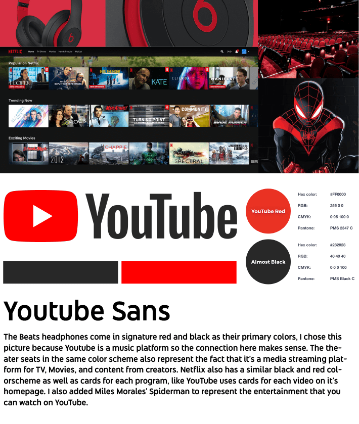
The mood board I made reflects contains pictures that I think reflect what YouTube does and is used for. While according to Plutchik’s Wheel of Emotions, the color red signifies negative emotions, I believe it lends itself to being Visceral and giving users that feeling that they are using something fun and sleek. I brought in the YouTube Sans type face as well, and wanted to convey everything that YouTube is using the images I chose.
Sources
Cao, Jerry. “Web Design Color Theory: How to Create the Right Emotions with Color in Web Design.” TNW | Tnw, 27 Apr. 2021, thenextweb.com/news/how-to-create-the-right-emotions-with-color-in-web-design.
Performance by Don Norman, YouTube, TED , 9 Mar. 2009, http://www.youtube.com/watch?v=RlQEoJaLQRA&t=15s.
