
When most people think about graphic design, they usually think about the visual components of design such as logos, or how something is styled. What rarely comes to mind to everyone else besides designers however is typography. Typography can make or break a design and learning to understand the similarities and differences between type faces and how to incorporate text in a cohesive way is a challenge but also defines which designers have honed-in on their craft, and who hasn’t. The it is the difference between amateur and professional when it comes to working as a designer.
This week’s assignments were a crash course in Typography and stylization through the use of text. The first project was a font mood board using six different nouns with three examples for each noun laid out on three pages. “A mood board is a collection of images, fonts, colors, art styles, patterns, textures, and any other design element that helps define the direction of the design. This can be for a brand identity, web design, or marketing campaign”. (Jesh Anies) The nouns I chose were Space, Food, Ocean, Airplane, Human, New York. I kept it random just for this exercise so I wouldn’t get stuck on one word’s moods. I began my work by sketching in my notebook. I came up with different ideas to express what I wanted to see when choosing fonts. After I had an idea of what I wanted, I created different moods with the same word by font changes for the six nouns that I chose trying to keep the fonts different enough to express different moods for the same word once I began working on my computer. This Exercise helped me understand the power of fonts and how words and designs can be interpreted differently depending on the font and text layout of your work.

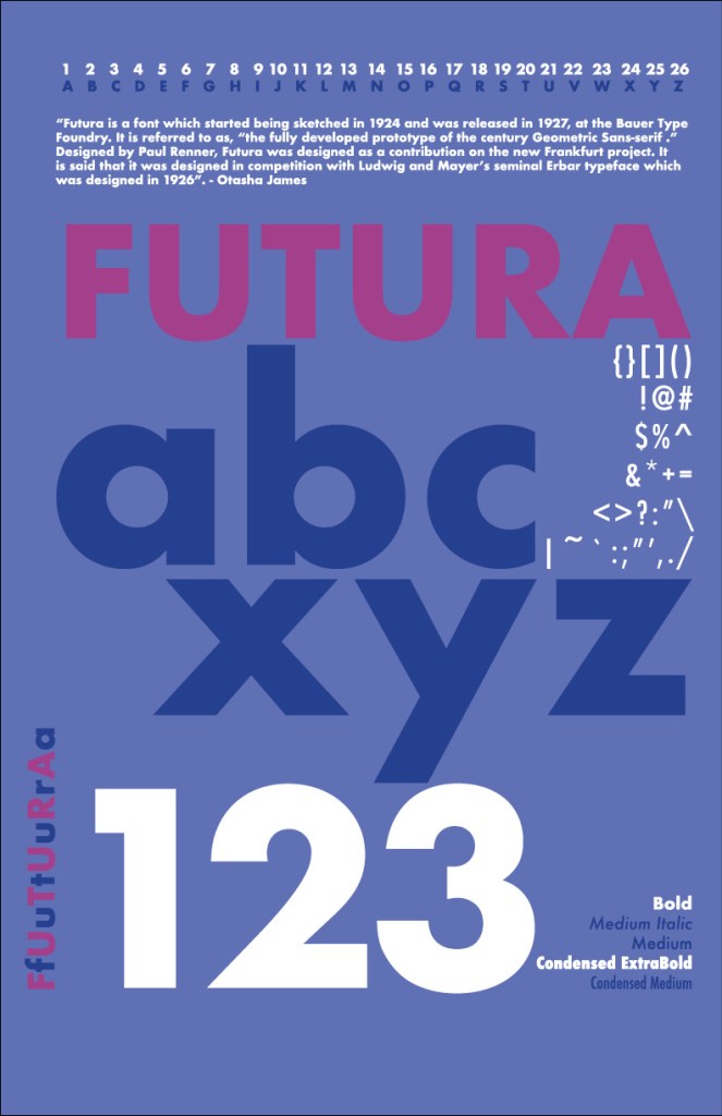
Continuing my work, I created a Type specimen poster. These posters show off typefaces by displaying different characters and styles using a specific typeface. For this project, I chose Futura as the classic font I used for this project. “A type specimen is a piece of design that demonstrates the range of a given typeface. They are used by designers when trying to determine the right font for a project. On a type specimen, each variation of the typeface should be present (e.g. regular, bold, italic, bold italic, etc.)”. (Julia Pike) In this project I chose to use two colors, as well as white to create the poster. I wanted to highlight both lower case and capital letters, numbers, symbols and everything that showed the range of the font that I chose. Considering this is the first type specimen poster I have created (I have been in design for a decade almost) I was excited to create something with my own unique style to it.
For the final project this week, it was time to circle back to last week’s work, and revisit the company that I am rebranding, Bass Center. This week we were tasked with creating a business identity system for our small business. These include standard branding conventions such as business cards, letter heads, etc. Materials that the company can use to spread knowledge of its existence, or simply just promote. “Identity – or visual identity, or visual identity system, or brand identity system – is a package of visual devices that an organization uses to communicate the brand, such as graphic imagery, a color system, fonts and yes, a logo. The system may or may not also include collateral such as stationery, brochures and signage, plus written content such as key messages and a positioning statement”. (www.stonesoupcreative.com) The themes used in the branding of the company such as fonts, and colors were kept uniform throughout the deliverables for the business identity. Overall, it is starting to look much better than the older look the small business had. It’s not that it was bad as much as over time, sometimes brands need a refresh! With its modern look and feel, the new branding convention is sure to draw in new customers and bring back old customers alike!
Sources
Anies, J. (2021, June 21). What is a Mood Board and Why is it Important? Syrup Marketing. https://syrupmarketing.com/what-is-a-mood-board-and-why-is-it-important/.
Pike, J. (n.d.). Fundamentals of digital design. Julia Pike ATLS 3030, Fundamentals of Digital Design, Spring 2015. https://creative.colorado.edu/~jupi6624/fodd/about.html.
Medina, J., & Medina, J. (2020, May 25). The History of Futura. CUNY Rare Book Scholars. https://rarebooks.commons.gc.cuny.edu/2020/05/25/the-history-of-futura/.
What is the difference between a logo, identity and brand? Stone Soup Creative. (2019, August 13). https://www.stonesoupcreative.com/difference-logo-identity-brand/.
