
Using the data collected last week, we continue by starting the process of encoding data visually. For this project I am using datawrapper.de to create data visuals based on the data provided. The focus of visualization was creating maps based on a data source from last week as well as creating data visualizations using different graph types that best suit the data sets that I created. While data wrapper is straight forward, I had a few road bumps in the process trying to make my data set translatable for the software but once that was out of the way, creating maps and data visualizations was quick and easy to do.
3 map types

Choropleth maps use color to identify specific areas, cities, states, regions or countries. It uses colors to show the spectrum of the data that it reflects. “Choropleth maps are popular thematic maps used to represent statistical data through various shading patterns or symbols on predetermined geographic areas “. (DeLorenzo and Dugger) These are used to show data such as the spread of Covid-19 and other illnesses, voter turn-out and other political data sets, and any data that can be encoded to show the spectrum of a specific data set.
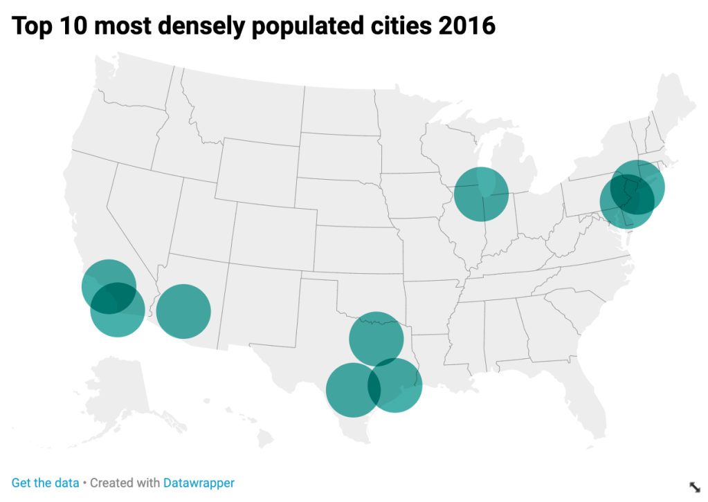
Symbols maps are used to show things such as area or population density, percentages in different areas, popularity of a product or person, etc. They can use symbols of varying size to describe data. Any iconography or symbol used to represent a space or location on a map falls under this category. These maps are similar very similar to Choropleth maps but home in on data with greater detail. “If you want to map absolute data, consider a symbol map instead.” (Datawrapper)
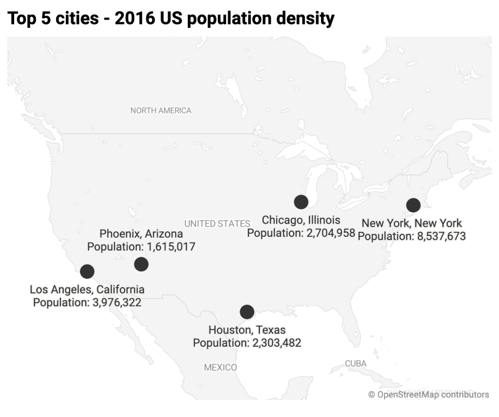
The third kind is a locator map, and much like apple maps, ways, or embedded google maps on webpages, locator maps help identify locals and events. “A locator map, sometimes referred to simply as a locator, is typically a simple map used in cartography to show the location of a particular geographic area within its larger and presumably more familiar context. Depending on the needs of the cartographer, this type of map can be used on its own or as an inset or addition to a larger map”.
Learning to use datawrapper to create data visuals and maps is a straightforward process. Importing Microsoft Excel spread sheets can be a hit or miss but are easily correctable and can be replaced by re uploading. It’s a great tool for encoding data visuals and presenting a professional looking visualization.
Resources
DeLorenzo, Nicole, and Amy Dugger. Story Map Journal. www.arcgis.com/apps/MapJournal/index.html?appid=75eff041036d40cf8e70df99641004ca.
Datawrapper. “What to Consider When Creating Choropleth Maps.” Datawrapper Academy, academy.datawrapper.de/article/134-what-to-consider-when-creating-choropleth-maps.
“Locator Map.” Wikipedia, Wikimedia Foundation, 21 Apr. 2020, en.wikipedia.org/wiki/Locator_map.
