
For this week’s blog post I collected 3 data sets to set up as possible data visualization encoding. The first Geographical data set was population for US cities. The second is from a public data source (data.worldbank.org) detailing life expectancy at birth from 1960-2019. The third data set shows the popularity of Apple & Google’s mobile hardware by state.
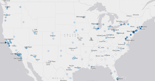
Geographical Data
This data describes the population for US cities. It breaks the information down by land area and population density. The data can be analyzed in several ways depending on what answers you are looking for. Questions a user may ask are:
- What was the biggest land area?
- What cities had a population density over a million?
- What city was the least populated in 2016?
Data driven declarative charts and visuals that can break down this data set easily for people to be able to view are probably going to work the best for this specific type of data. Having the data visualized in very straight forward and basic ways will allow users to understand the data quickly. A pie graph for example can show population in a straightforward way with the biggest population density taking up the largest section of the graph, with the least taking up the smallest.
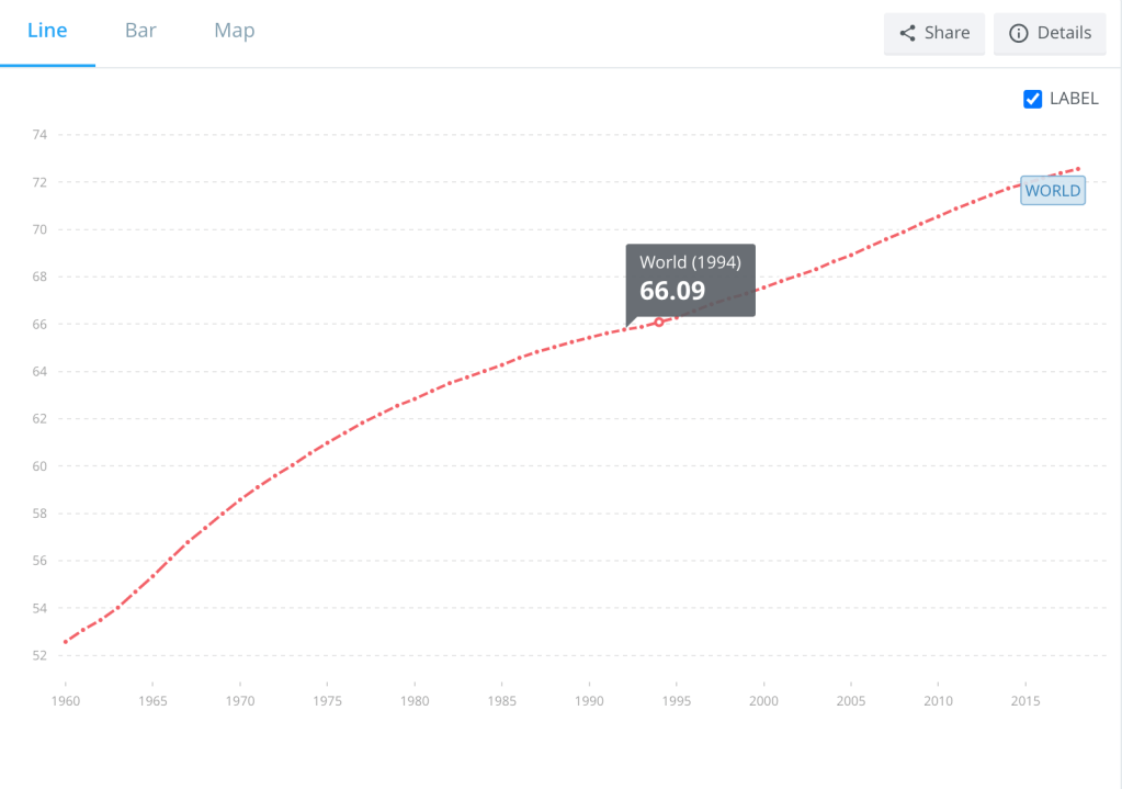
Public Data
This data set details life expectancy at birth from 1960-2019 for every country in the world. This is broken down by country, year, and expectancy. The data here can be analyzed by the following questions:
- What year saw the largest increase in life expectancy?
- What country saw the largest increase in life expectancy?
- What country saw the steadiest life expectancy numbers?
Data-driven-exploratory visualizations that chart out years and spikes in life expectancy would work best for this data set. Having the ability to explore the data in more than one way visually would be the best way to go about displaying this data.
IOS vs Android Data Set
I created a data set for IOS vs Andriod mobile devices broken down by state. Here I wanted to see which product was more favorable in the US and breaking it down by states would be an accurate way of determining which one was more popular. The data was separated by product type, states, and ranking percentage. Other questions that can be determined through this data set are:
- Which Product was most popular?
- Which state had the biggest difference in percentage?
- Which state had the most split percentage?
Data-driven-exploratory visualizations would work best here, using simple shapes interpreting this data. The data set itself isn’t complex and doesn’t require detailed charts of graphs. Most of the data is binary and using simple graphs would suffice.
Sources
Population Density for U.S. Cities Statistics. www.governing.com/gov-data/population-density-land-area-cities-map.html.
“Life Expectancy at Birth, Total (Years).” Data, data.worldbank.org/indicator/SP.DYN.LE00.IN.
2018, Published: 7 November. “Mobile OS Popularity by US State.” DeviceAtlas, 9 Nov. 2018, deviceatlas.com/blog/mobile-os-popularity-by-us-state.
