
When we think about data collection, we usually visualize numbers and information to an overwhelming degree; numbers jumbled up looking like code lines from the Matrix movies, but data visualization helps end users learn, and understand said data using visual methods that that correspond to the data being encoded. Since there are varying types of data, information visuals should also be able to adapt to these different data sets in order to be understood clearly by a general audience. These different forms of information visuals have been broken up into 4 different sections: conceptual-declarative, conceptual-exploratory, data-driven-declarative, and data-driven-exploratory.
Conceptual-Declarative
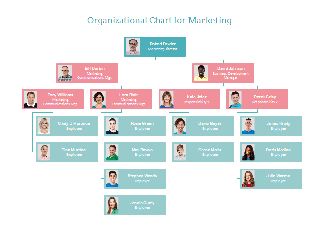
These visuals are composed of basic shapes and metaphors that can quickly be seen by an audience and easily understood. Conceptual focuses on ideas while declarative focuses on documenting and designing. “Either you are visualizing concepts and qualitive information or you’re plotting data and information”. (Berinato) Simplicity is key here. Many of these data visuals are used in education and business consultation presentations.
Conceptual-Exploratory
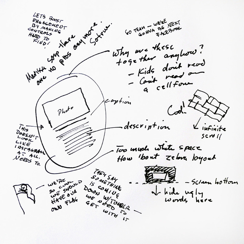
Ideas that have comparisons or encourage the user to sort through data are Conceptual- Exploratory. An example of this would be an idea web, or a site map. They are written or drawn out data with visual guides to help categorize it to find ways to visualize the information being encoded. “These are the brainstorm sketches that help work through complex processes, such as when you start to sketch out concepts for how to categorize and show data for an infographic. Some experimentation and exploration is required to find the right method, and the goal here is discovery and generating ideas and different ways of thinking”. (Crick )
Data-Driven-Declarative
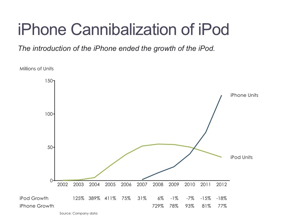
Data driven declarative are graphs and other common rudimentary charts that are commonly used in data visualization. These types of visualizations are common for academic and business presentations and literature. While displaying complex data at times, their visual form is basic and more analytical than visually appealing.
Data-Driven-Exploratory
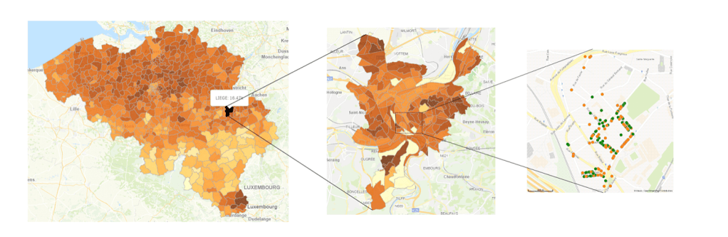
Data driven exploratory visuals can be complex. It has layers and the user can be encouraged to sort through data to reach deeper levels of data. “good examples of exploratory visualizations are geographical heatmaps or dotmaps such as the Social explorer US elections map”. (Rooms) It also encourages users to question how this data can be interpreted and analyzed. It’s not as straight forward as other forms of data visualization and may take time to fully take in.
Resources
Berinato, Scott. Good Charts: the HBR Guide to Making Smarter, More Persuasive Data Visualizations. Harvard Business Review Press, 2016.
Crick , Shelley. “Types of Visuals and When to Use Them.” Thought Design, 2 June 2019, shelleycrick.com/types-of-visuals-and-when-to-use-them/.
Rooms, Brecht De. How to Create Good Data Visualizations to Make Correct Data-Driven Decisions, http://www.ae.be/blog-en/data-visualizations-for-data-driven-decisions.
