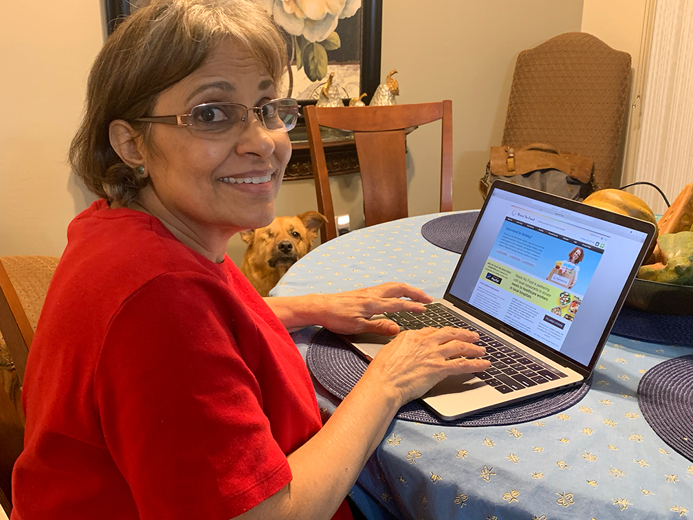
Today, I had 3 people participate in Wastenofood.org’s usability testing session. Their names are Indira, Frances, and Hilda. They were new users to the site and had no prior experience with it. The 3 sessions took 7-10 minutes in each and the tasks were successfully accomplished.
Tasks:
- You want to contribute to the wastenofood cause. How would you go about submitting donation?
- As a new user, you want to know more about wastenofood.org. Navigate to that information.
- Fill out a form to volunteer (you do not have to actually send it).
- Find out what kind of foods are available for donations.
- Fill out a Charity partnership form (you do not have to actually send it).
After they signed the consent form, the testing was started.
Participant 1 – Indira, 33 years old
- Indira completed all the tasks successfully, For the first task she was confused as to whether to choose the “financial donors” tab or the “food donors” tab. Only until she got to the “financial donors” page did she complete the task.
- She easily found the “About us” page when completing the second task
- She easily found the “volunteer” page when completing the third task
- She found the “Food facts” tab but was asking herself out loud which tab would she be able to find the information needed to complete the fourth task. This one took longer than the other 3.
- She found the page for charities quickly and was able to fill out the form successfully.
Participant 2 – Frances, 28 years old
- Frances navigated to the donation page easier than Indira did. It still was confusing to have separate food and financial donor pages, but it didn’t take long for her to figure out the right one.
- She easily found the “About us” page when completing the second task
- She easily found the “volunteer” page when completing the third task
- She found the “Food facts” tab but had trouble understanding the question for a few seconds when it came to what to look for on the website. Once she saw the “Food facts tab, she navigated there quickly.
- She found the page for charities quickly and was able to fill out the form successfully.

Participant 3 – Hilda, 58 years old
- Hilda took a minute to study the homepage and all the tabs available in the navigation. She also asked about the difference between the food and financial donor pages, and then realized the right page to navigate was to the financial donors page. She said that the title of that page confused her thinking it was companies and people who help fund the non-profit. Changing the title would help this.
- She easily found the “About us” page when completing the second task
- She easily found the “volunteer” page when completing the third task
- It took Hilda a few minutes to find this information and the question itself didn’t seem to be a good one for any of the participants until they realized there was a food “facts section”. This needs a title change more relevant to the information.
- She found the page for charities quickly and was able to fill out the form successfully.
Conclusion
The testing provided some valuable insight as to things that are good about the site navigation wise, and areas that need improvement. Changing the title for “financial donors” or merging both food and financial donors to one section might help make it easier for users to access without the confusion they feel when first visiting the site. The food facts section should be titled differently so people understand what its purpose is better.
