
UX Analysis: Reddit
About Reddit.com
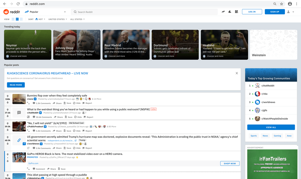
As far as UX design goes, I believe reddit may be designed for function over aesthetics and more specifically; content curation. This is in no way a criticism of the design, but a compliment as a solid foundation for its well thought out structure. Reddit is much easier and straight forward for users to access than most modern sophisticated websites dedicated to things such as news consumption and other media outlets. The way it allows you to curate the content you want to see, (including the news) is a great fundamental approach to personalized content. The functionality is organized and almost seamless and the layout makes me feel confident that I will see what I want to see because my interest in customized media will be met.
Feel & need
When you first use the site, it encourages you to start finding things you find interesting and subscribing to those particular channels. Once you do that, they appear on your home reddit screen personalizing your experience. By subscribing to different subreddits, you are placing priority on those interests allowing you to view the content you want to see and taking the guess work out of the process; saving you time as well as allowing customized experiences from user to user. The subscription method for subreddits or similarly, youtube channels, makes me feel amazed because my need for customized content if fulfilled and constantly evolving. It is a time saver! It’s part of a broader idea of customized content sharing that has been part of the social media experience. Another feature I love that is used by almost all social media, is the ‘trending’ feature, as well as the ‘explore new subreddits’ feature as both allow you to explore what is popular and dig into new interests simultaneously. It adds to the experience as there is always something new to discover. It makes me feel Curious because my need to explore easily is met. I know that the possibility of digging deeper is available to me and easily accessible.
Other notes
- The subreddit function makes me feel focused in my search for content because my need to explore is met. Each subreddit is specific to the subject that it was made for.
- The categories tabs makes me feel at ease because my need to organize my content is met. It organizes content in an effective way when navigating the site for different subjects.

UI Analysis
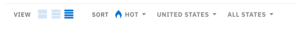
The user interface of reddit may seem a bit underwhelming to some at first because of the fusion of forum-based architecture mixed with a more media friendly approach. It made me feel overwhelmed at first because my need for ease of access in layout was not met. I had never really seen or used such an interface before in a previous website. I was never big on online forums as I found the layouts limiting in functionality. I feel contentment with the customization options because my need for added customization was met. They allow you to increase or decrease the size of the individual content blocks among other UI customizations.
Other notes
- The light and dark mode of reddit made me feel powerful because my need to customize or change the appearance was met. I had the ability to customize my entire experience on this site. The color choices of grey/white for light mode and dark grey/black for dark mode were both easy on the eyes and not overwhelming which would be easy to do with this much content displayed on a single page.
- The actual topic pages where you can comment make me feel excited because my need to explore topics important to me and discuss them was met. I get to read the content I want and engage in conversation with the community about said topic.

- The Profile and user settings pages make me feel satisfied because my need to change settings was met. Reddit feels tailored and customized for me. I think that any user experience designer would want an end user to feel that way about the product they design. The settings are very simple and intuitive to locate and use while browsing reddit.
UX Analysis: CNN
About CNN.com
In representation of most modern websites dedicated to the news, I chose CNN because in contrast to reddit, it is not a customizable experience first. CNN is a news site that displays the same stories for everyone as it wasn’t designed with much customization options in mind.

FEEL & NEED
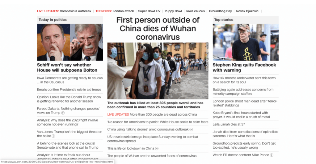
The first thing I feel when landing on the home page is clutter. While visually professional and functional, it is not done in the most organized or accessible way for users. For starters, the home page makes me feel overwhelmed because my need for structured content was not met. The oversized promotions that pop out front and center before you can even begin to browse the news are unnecessary. The way the news is categorized is frustrating, because my need to quickly read a story was not met. You wouldn’t even notice it unless you scroll to the bottom of the page to see some sort of organization by category. The top stories make me feel confused because my need to understand the hierarchy was not met. They are separated into two or sometimes three columns with nothing to categorize them, just seemingly random stories put together.
Other notes
- The actual stories, or videos are half way cut off for big promotional banners that take up half the real estate of whats viewable when first landing on a page. This makes me feel frustrated because my need to quickly view a story was not met. It prioritizes promotions over stories. If you are watching a serious or tragic story, the last thing you want to immediately see is some commercial or promotion, over an important story.

- The site doesn’t know what it wants to show you it seems. It’s either promotions or content and it feels like they are constantly at odds with each other, as a viewer and user it’s a frustrating experience. It makes me feel upset sometimes, because you could be viewing potentially important information, but have to sit through promotions and commercials. It feels very old school in that regard and my need to quickly absorb that information is delayed until after the promotions.
UI Analysis
CNN.com has a very corporate style, I feel it is bland because my need for modern design is not met. It simply uses accents of the company’s signature red color with black to contrast it but it feels uninspired. The div sections and content seem very blocky and stacked together in a way that isn’t really appealing, it makes me feel tired after a while because you have to really search for what you are looking for if it isn’t the top story. It does not meet my need of quick reading. I do however, like how the main top story is front and center with bigger words as the header. It makes me feel excited to see what that story may be because of its placement on the page and it meets my need of hierarchy in that one example.

Other notes
- The navigation bar’s style makes me feel indifferent because my need of organizing content is not met while being almost invisible. You barely notice it is there when when a huge promotion is on top of it.
- The promotions themselves make me feel annoyed because they are everywhere and do not meet my needs of reading or watching the news without being bombarded with a commercial or promotion.
What I have learned
This exercise expands on what we learned last week. There are deeper reasons other than simply liking or not liking something we choose to spend time consuming be it media, or a product, gift, service, etc. This also helped me understand that the way I consume media is very new age compared to the more traditional methods of viewing the news on such sites such as CNN. By analyzing my feelings and needs it has led to a greater understanding of my own reasoning when it comes to why I favor sites like reddit for their customization options.
